

There is something about the right color that can completely change how a room feels.
It can make a space feel warmer, calmer, more inviting, or simply more like you. And when it comes to choosing colors for your home, it is not just about what is trending. It is about finding colors that work with your lifestyle, your furnishings, your natural surroundings, and the way you want to feel in your space.
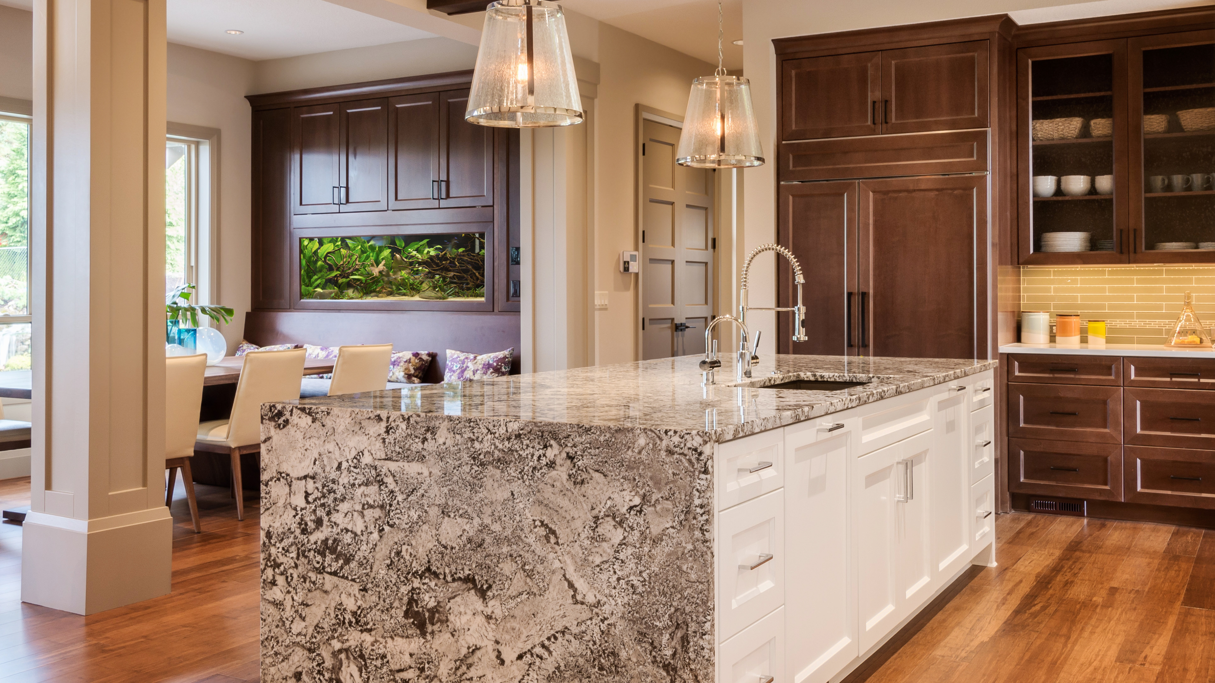
As we look ahead to 2027, paint manufacturers are introducing some beautiful colors that reflect a growing appreciation for nature-inspired shades, earthy undertones, softer blues, and warm, grounded neutrals.
One thing I am noticing is that color is becoming more personal. Homeowners are moving beyond choosing a safe neutral simply because it is easy. They are looking for ways to bring warmth, character, and a little more individuality into their homes.
Let's take a look at some of the colors making their way into 2027 interior design conversations.
1. Grounded Greens: Bringing Nature Indoors
Green continues to have a strong presence in interior design, and the 2027 color selections give us several beautiful ways to work with it.
From deeper, grounded greens to softer botanical shades, these colors bring a natural quality to a room without necessarily making it feel overly bold.
Some shades worth exploring include:
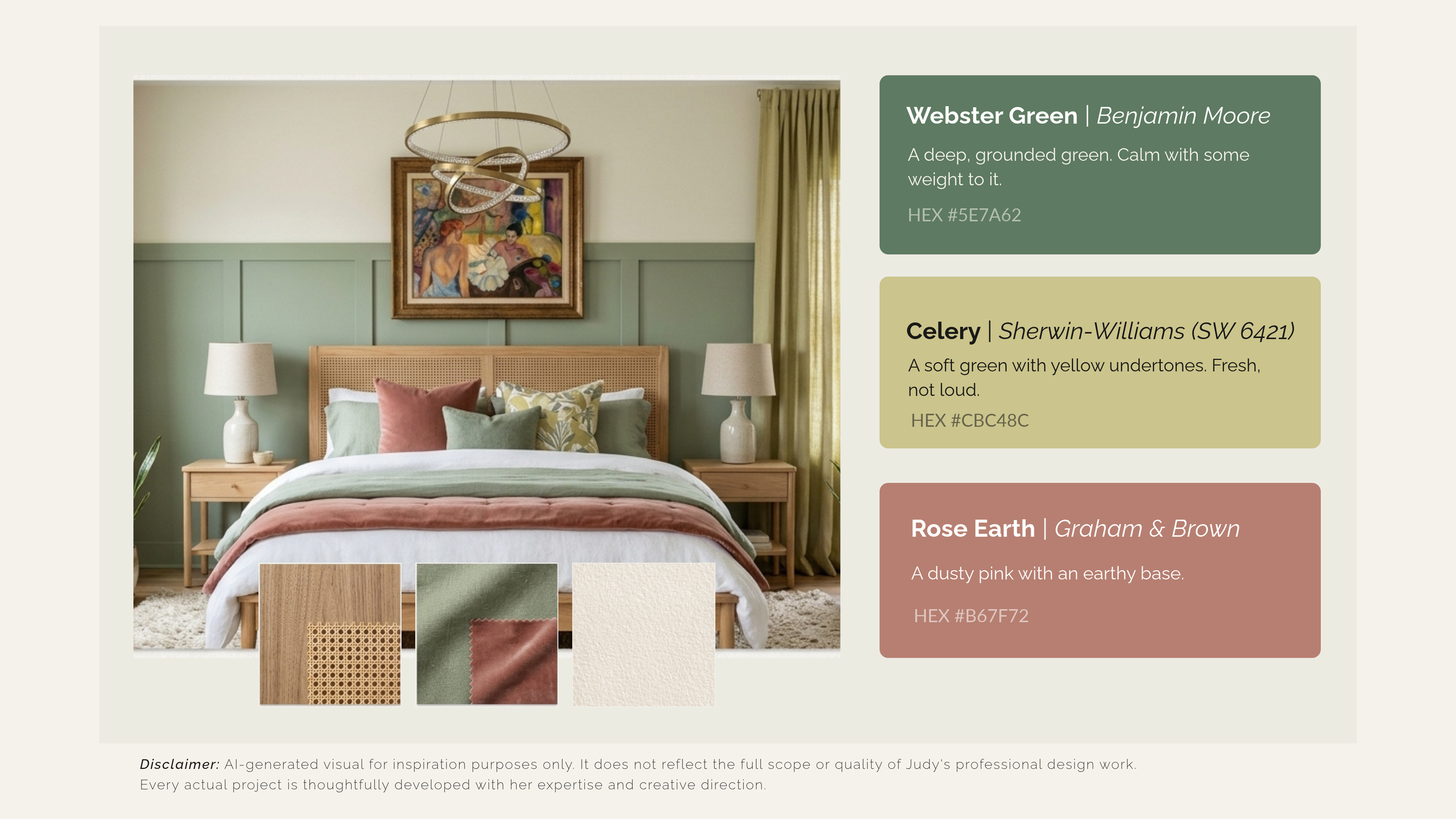
Webster Green by Benjamin Moore
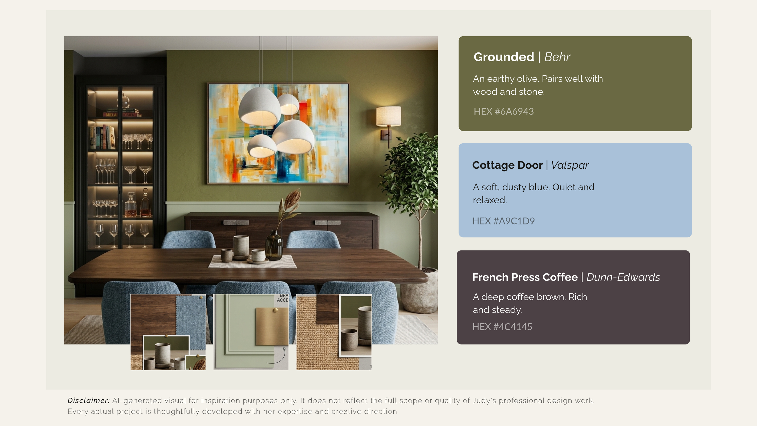
Grounded by Behr
Celery by Sherwin-Williams
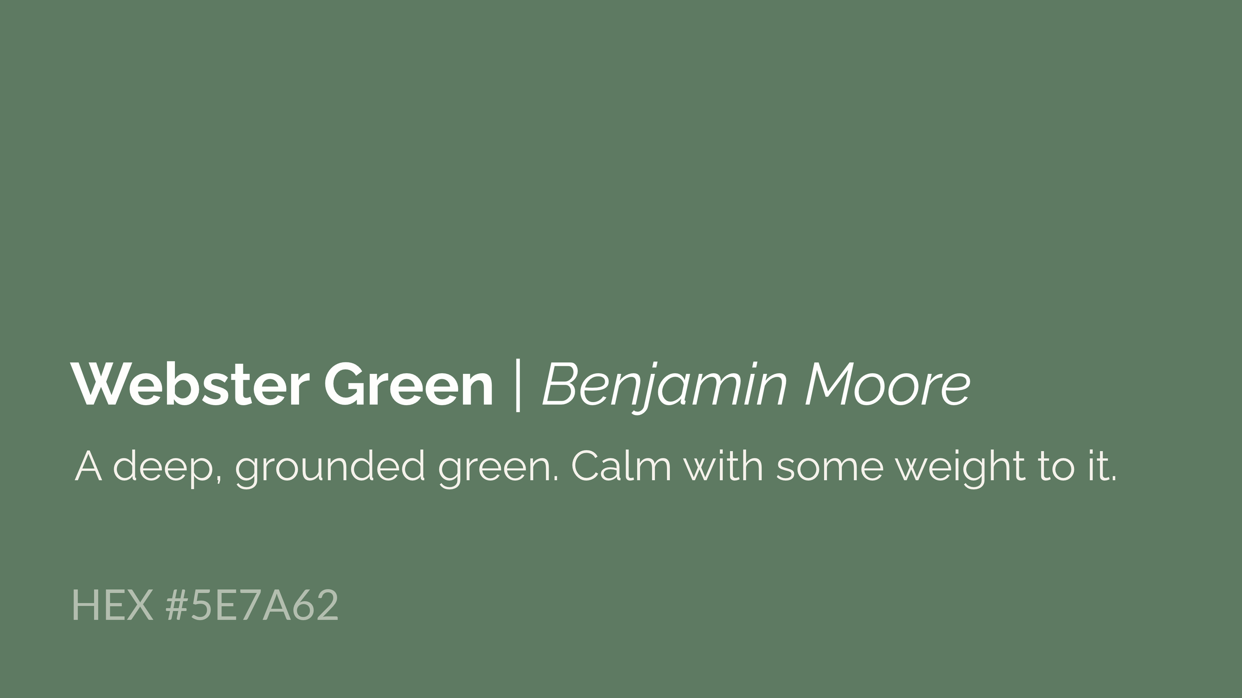
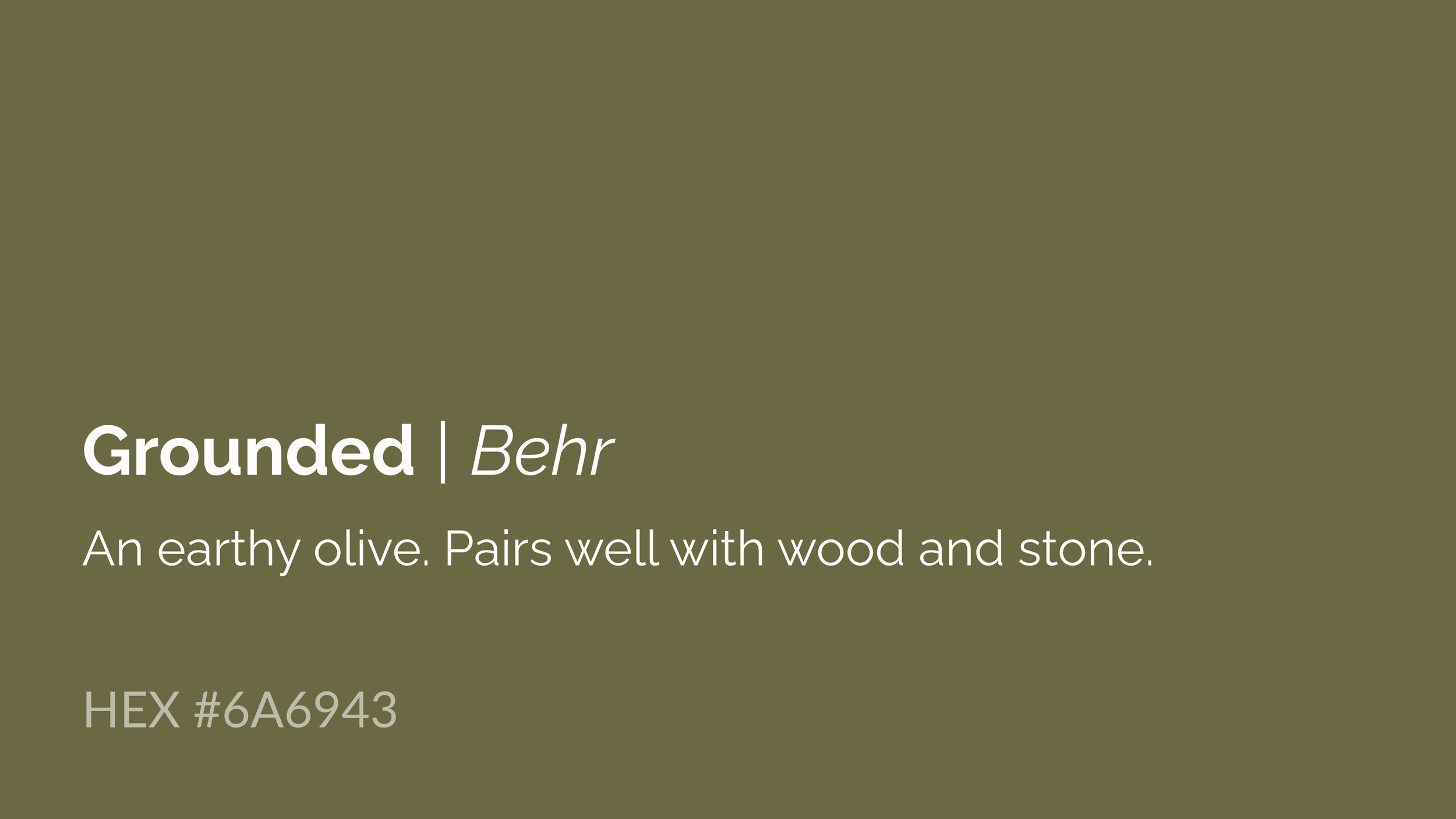
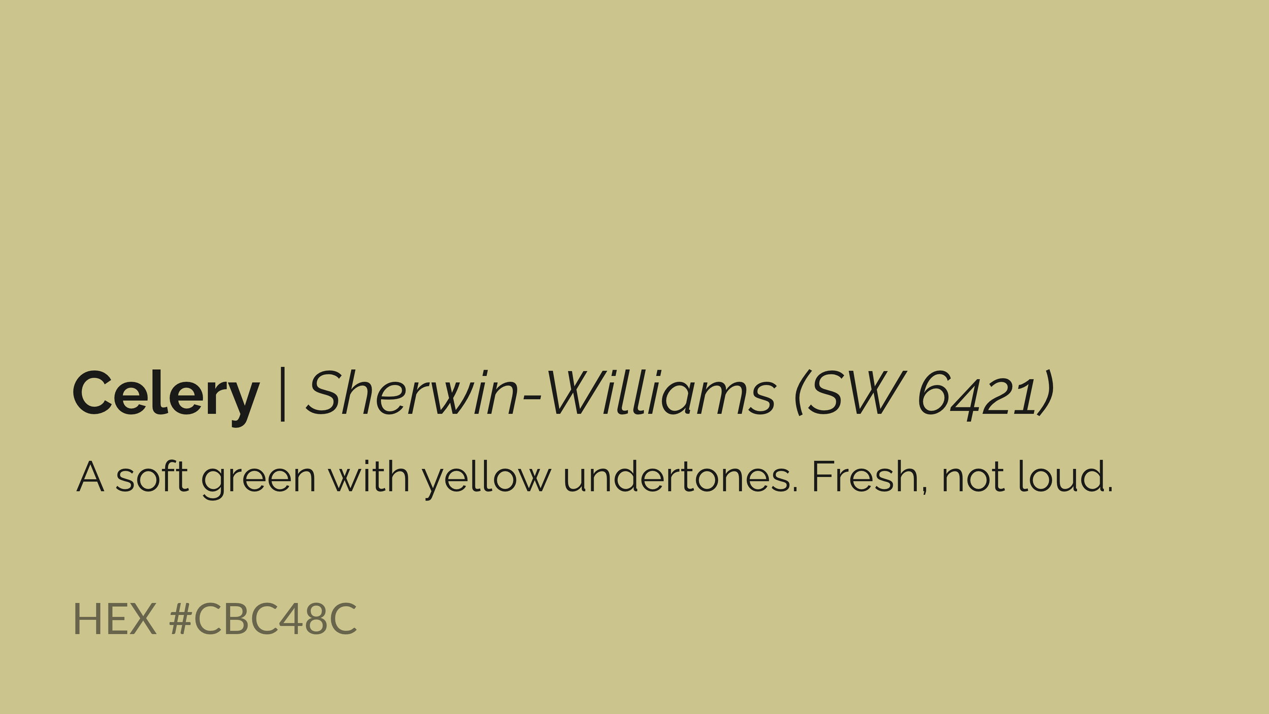
A deeper green can be beautiful in a study, dining room, kitchen cabinetry, or as an accent wall. Softer greens can work wonderfully in bedrooms, living spaces, and areas where you want a lighter, more relaxed atmosphere.
I especially like how these greens work with natural wood, stone, linen, and other organic textures.
There is no need to bring the entire outdoors inside. Sometimes one thoughtfully selected color is enough.
2. Smoky Blues: A Softer Approach to Color
If you love blue but do not want a room to feel too cool or overly traditional, the newer muted blue shades are worth considering.
Artifact by Glidden and Cottage Door by Valspar offer two different approaches to this color family.
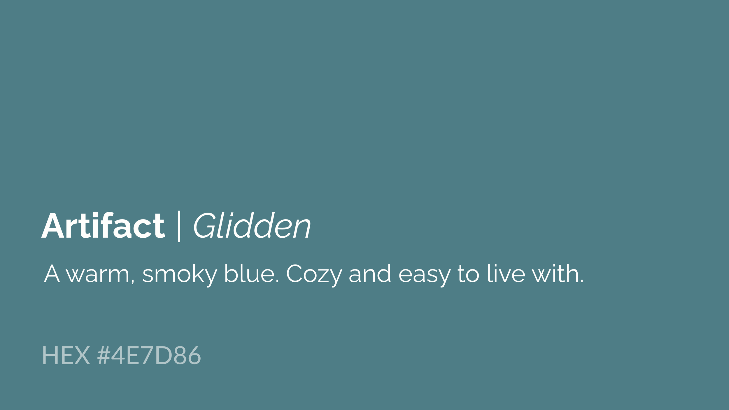
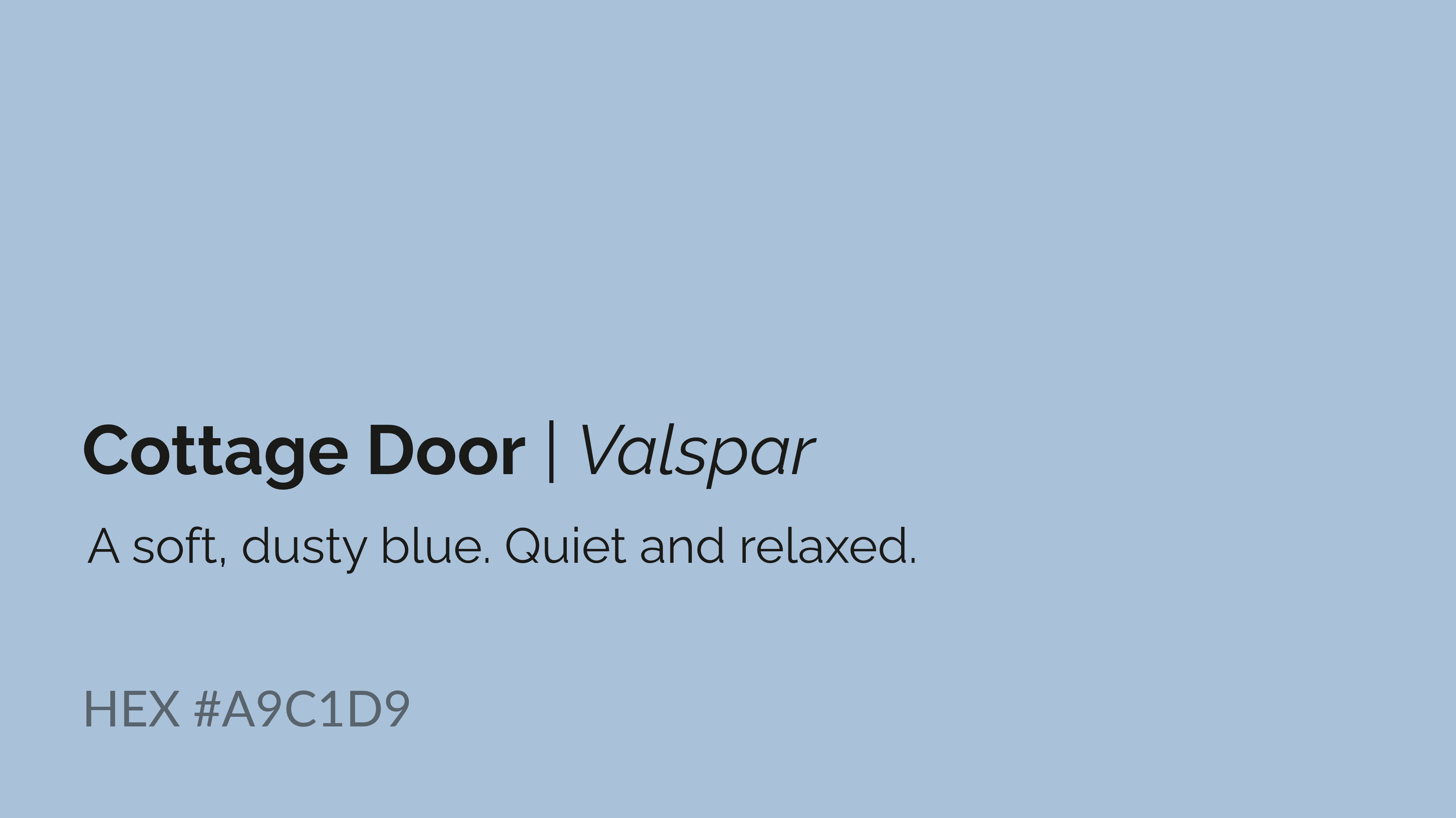
Smoky blues can bring a sense of quiet sophistication to living rooms, bedrooms, bathrooms, and even kitchen cabinetry.
They pair beautifully with warm whites, natural wood, soft taupes, and brushed metal finishes.
The trick is to pay attention to the undertones. A blue with gray undertones can feel very different from one with green or warmer undertones, especially when the natural light changes throughout the day.
3. Earthy Pinks and Terracotta: Warmth Without Too Much Color
For those who want something a little different from the usual beige and gray, earthy pinks and warm terracotta shades offer a lovely alternative.
Rose Earth by Graham & Brown and Deep Rooted by Dutch Boy are examples of this warmer direction.

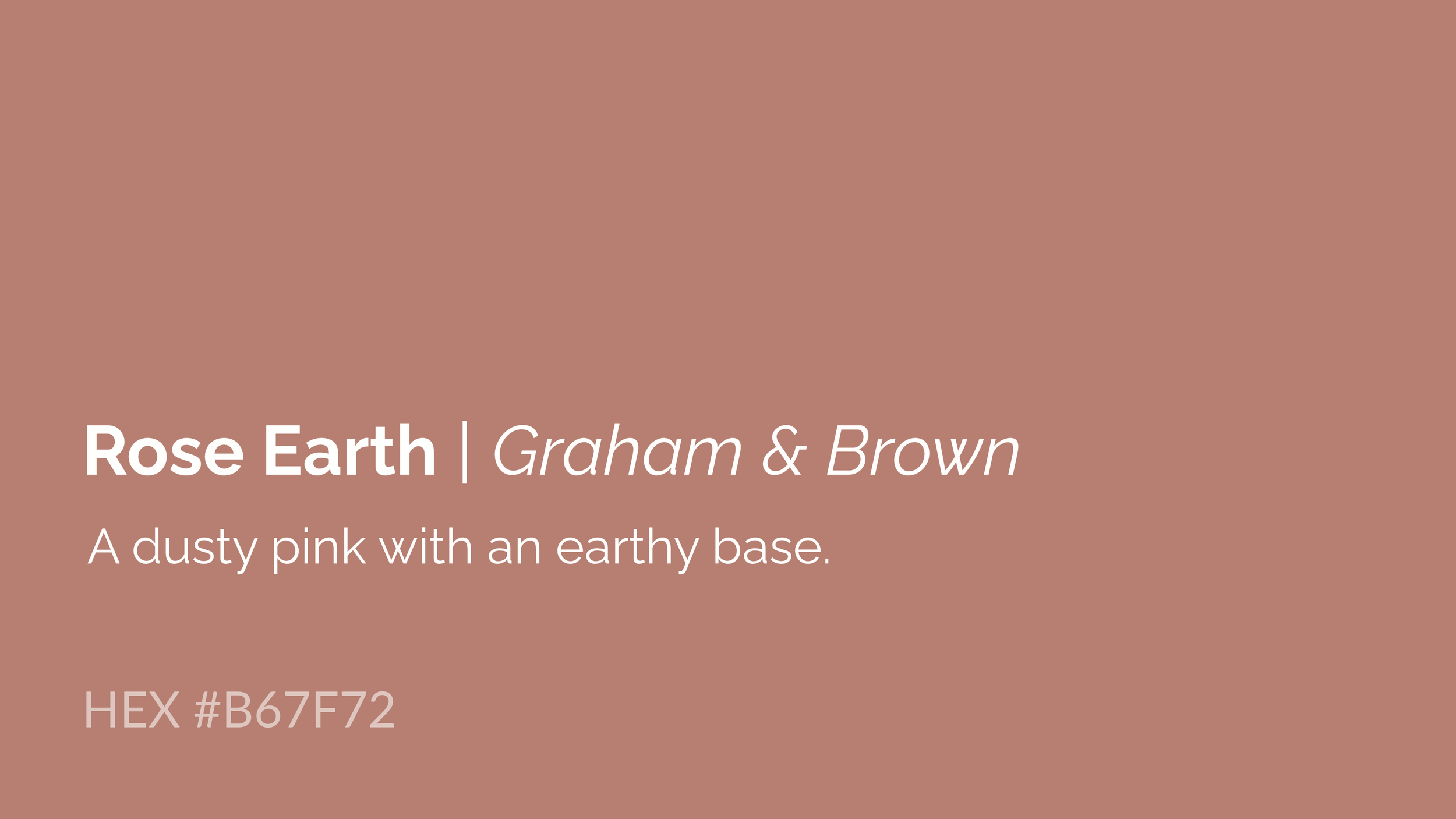
These colors can add personality without making a room feel overly decorated.
Consider using them in a powder room, dining area, bedroom, entryway, or through smaller design details such as upholstery, artwork, and accessories.
They work particularly well with natural materials, warm wood tones, creamy whites, and muted greens.
4. Rich Coffee Browns: A Return to Grounded Neutrals

Not every neutral needs to be white, gray, or beige.
French Press Coffee by Dunn-Edwards is a beautiful example of a deeper brown that can bring richness and depth to an interior.
Deep coffee tones can work well in a library, office, dining room, or as an accent color in a larger design scheme.
When paired with lighter fabrics, warm wood, natural stone, and thoughtful lighting, darker browns can feel inviting rather than heavy. For homeowners who want a little more character in their interiors, this is a color family worth exploring.
5. What These 2027 Color Trends Mean for Your Home
Looking at the colors being introduced for 2027, I see an opportunity to move toward more intentional color choices.
We are seeing beautiful greens, softer blues, earthy pinks, terracotta, and deeper browns. But that does not mean every home needs to follow every trend.
The best color is the one that works for your home.
Before choosing a paint color, I recommend considering a few things:
Natural lighting: Does your room receive morning or afternoon sunlight? Is it bright, shaded, or mostly dependent on artificial lighting?
Existing materials: Look at your flooring, countertops, cabinetry, furniture, and fabrics. The undertones need to work together.
Room function: A bedroom, home office, kitchen, and living room all serve different purposes. Think about how you want each space to feel and function.
Your personal style: Do you gravitate toward warm and earthy, light and airy, or deeper and more dramatic colors?
Longevity: Trends can be fun, but larger design investments should still feel right several years from now.
And one more thing: always test paint samples in your actual space. A color that looks beautiful on a paint chip or online can look very different on your walls.
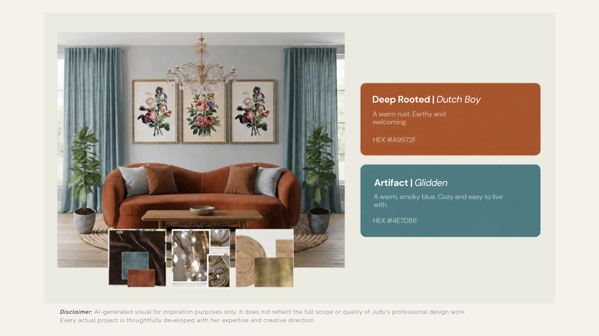
Disclaimer: AI-generated visual for inspiration purposes only. It does not reflect the full scope or quality of Judy's professional design work. Every actual project is thoughtfully developed with her expertise and creative direction.
6. Color Is Only One Part of a Healthier Home
At Go Green Fine Interiors, I believe that a beautiful home should also support your well-being.
Color is one part of that experience, but it is not the only consideration.
The materials, furnishings, finishes, lighting, functionality, and overall layout all contribute to how a space looks and feels.
When selecting paint and finishes, I encourage homeowners to look beyond the color itself. Consider the product's ingredients, VOC content, emissions information, and manufacturer documentation. Lower-VOC products can be one consideration when making more health-conscious choices, although low-VOC does not automatically mean emission-free or completely non-toxic.
Sustainable interior design is not about replacing everything or creating a home that looks a certain way. It is about making thoughtful decisions that balance beauty, quality, functionality, and environmental responsibility.
That is where good design makes a difference.
7. A Note About Pantone's 2027 Color of the Year
One announcement we are still looking forward to is Pantone's 2027 Color of the Year!
As of November 17, 2026, Pantone has not yet officially revealed its 2027 selection. Its official Color of the Year event in Miami is scheduled for December 3, 2026.
So, we will have to wait just a little longer to discover which color Pantone selects to represent the year ahead.
I am looking forward to seeing how its choice fits into the beautiful range of colors already emerging for 2027.
Be sure to check back. I will be keeping an eye on the announcement and sharing my thoughts on how the selected color could translate into residential interiors.
You can check the event here →
8. Ready to Choose the Right Colors for Your Home?
Choosing paint colors can be surprisingly overwhelming.
You may love a color in a magazine, save it on Pinterest, or bring home several paint samples, only to find that none of them look quite right once they are on your walls.
And that is because choosing color involves more than finding a pretty shade. It takes an understanding of undertones, lighting, materials, proportions, and how all the elements in a room work together.
At Go Green Fine Interiors, we offer paint color consultations and personalized interior design services to help you make confident decisions.
Whether you are refreshing one room, updating your kitchen, planning a renovation, or creating a more wellness-centered home, I would love to help you bring everything together.
Your home should be beautiful, functional, and supportive of the way you want to live.
Ready to make your home feel more like you? Let's talk.
Explore Go Green Fine Interiors' interior design and paint color consultation services.
Frequently Asked Questions About 2027 Interior Design Colors
What are the interior design color trends for 2027?
Emerging 2027 interior color selections include earthy greens, soft botanical greens, smoky blues, warm terracotta, muted pinks, and rich coffee browns. These colors offer homeowners alternatives to traditional neutrals while maintaining a comfortable and timeless feel.
What is the Pantone Color of the Year 2027?
As of November 17, 2026, Pantone has not officially revealed its 2027 Color of the Year. Its official Miami announcement event is scheduled for December 3, 2026. Check back for the official selection and interior design inspiration.
Are green paint colors still popular in 2027?
Yes. Green is particularly prominent in 2027 paint collections, ranging from soft celery and sage to deeper olive and grounded greens. These shades work beautifully with natural wood, stone, warm whites, and organic textures.
What are the best paint colors for a calming home?
Soft greens, muted blues, warm whites, and gentle earthy neutrals are popular choices for creating a relaxed atmosphere. The best shade depends on natural lighting, room function, existing materials, and personal preference.
What paint colors work best with natural wood and stone?
Earthy greens, warm neutrals, muted blues, terracotta, and soft off-whites can complement natural wood and stone. Always consider the undertones of your existing materials before selecting a paint color.
How do I choose a sustainable paint for my home?
Look beyond marketing labels and review the manufacturer's product information, VOC content, emissions testing or certifications, ingredients where disclosed, and recommended application practices. A lower-VOC product is one consideration, but it does not automatically mean completely emission-free.
Should I hire an interior designer for paint color selection?
An interior designer can help coordinate paint colors with flooring, cabinetry, furniture, lighting, and finishes. Professional guidance can reduce guesswork and help prevent costly color and material mistakes.
